An animated map of protests in the Middle East as they spread from country to country, updated with the most recent events.
The protests that drove Hosni Mubarak out of power in Egypt were only the beginning of a wave of civil unrest that has boiled over into nearly all of the Middle East. Tunisia had already driven longtime President Zine El Abidine Ben Ali from office, and by the beginning of February, unrest had spread to Jordan, Lebanon, and Sudan. Many more countries were to follow. This map depicts the tides of protests and government retaliations day by day, beginning in Tunisia and ending with the unresolved conflict in Libya. You can click through the days one by one with the green arrows or choose "Autoplay." To get the big picture, just turn off the info boxes and crank up the speed.
Ok say ask any budding geographer how do you measure tectonic events and they will probably quote: Richter scale, Fujitsu scale, may be the Mercalli or even the VEI...but are some of these too out of date - according to topical popular science programme like QI they are!
Tectonic recording and measurements now focus and refer to the following:
Now here is a tricky question I always get asked but am always somewhat reluctant to answer?
Pupil: What is the world's biggest/largest city?
Teacher: Well it depends what and how you measure it?
Pupil: ...silent and confused look..
Now the BBC have tried to have a go with their article on: What is the world's biggest city? Is it Chongqing in China - but only if you include the metropolitan and administrative areas..ho hum tricky indeed - i mean if London is 8million, what is Greater London (does the word metropolitan come in here?) - and where does the boundary for London start and stop...? I mean really we need to firstly break down what large or biggest actually refers to and means in context....well....?
Questions that need answering I feel - what are your thoughts and opinions?
From time to time it is easy to forget how lucky we are to have so much technology at our finger tips. Google maps is just one of those essential tools that all geographers should become familiar with. I have recently finished teaching a young group the basics of Google maps in making their own personal geography maps including place markers, street view and usual routes. Given the open ended nature of the task some students excelled themselves and independently went off and explored much more than i had thought was capable.
So keep the tasks open ended and independent and use Google maps more!
AFRICAN demography is unique. It is the only continent that will double in size, reaching 2 billion people by 2045 at current rates. Some countries, such as Liberia and Niger, are growing faster still. They are due to double in size in less than 20 years—an increase that is causing forecasts of Malthusian disaster for countries that cannot feed themselves. Yet Africa is also showing signs of embarking on the same transition towards smaller families that has occurred everywhere else, thus avoiding the Malthusian trap.
I am always reminded of the importance of this day due to the annual visit of one Emma Cole; a remarkable lady who has lived with HIV for over 20 years and has become synomyous with national and global campaigns (check out: http://thebangle.com/blog/tag/emma-cole/).
Luckily as a geographer it is part of the curriculum and some of the most interesting and important lessons i have taught over the past 6 years have been on this topic. Here are a few facts about HIV in the UK:
Over 90% of people with HIV were infected through sexual contact
You can now get tested for HIV using a saliva sample
HIV is not passed on through spitting, biting or sharing utensils
Only 1% of babies born to HIV positive mothers have HIV
You can get the results of an HIV test in just 15-20 minutes
There is no vaccine and no cure for HIV
Today the Guardian DataBlog - one of my favourite websites - has mapped 20years of HIV data; see the blurb below and then click the link:
The UNAIDSdata shows that since 1999, the year in which it is thought the HIV epidemic peaked globally, the number of new infections has fallen by 19%. We've mapped the prevalence of adults with HIV over the past 20 years, so you can see the patterns of the change throughout the world and that dispite the overall improvement some regions have got worse. The figures come from this UNAIDS spreadsheet and show the prevalence of HIV in adults aged 15 to 49, as a percentage of the population. Let us know what you think.
Also, Hans Rosling has produced and presented on Ted.com an interesting visual data display using his gapminder resources - the results and issues raised are fascinating, see below:
One of the biggest challenges, no matter where an individual lives, is the perception and stigma that is often associated with HIV and the issues surrounding safe sex (http://www.bbc.co.uk/news/uk-wales-15969512). Although in the UK we are lucky to have sex education as part of our compulsory core curriculum in all secondary (and primary) educational estblishments, in some areas of the world the message of safe sex is not discussed and simply swept under the carpet. In one of the world's emerging economies and potential superpowers, rates of HIV in certain Indian states are skyrocketing. The link belows shows a timeless clip, indicating how TV advertising and mobile phones are being used to combat the stigma and taboo subject of discussing and practising safe sex, ultimately to reduce levels of HIV infection: http://www.bbc.co.uk/worldservice/trust/whatwedo/where/asia/india/2008/04/080806_india_gates_condomcondom_video.shtml
I have been enjoying the way data is now presented - the internet has revolutionized the way data is both presented and interpreted; from Hans Rosling's Gapminder to world mapper to one of my favourite sites - information is beautiful! Check out the way devastation is represented in the context of the recent Thai floods - really makes you think....
Since it's creation Google Earth has made GIS popular and has been a timely boost for rebranding Cartography. People no longer view the world in one dimension and maps have now become more representative of the world we live in. Google Earth enables users to explore the world and contextualise our surroundings, helping to put back the local and global back in Geography.
The news that Google Earth has reached 1 billion users is celebrated by the 'one world many stories' project:
McClendon, now VP of Engineering at Google, looks forward to seeing what the next billion downloads brings. He sees geospatial technology as "not just a tool for those in cartography. It's now a part of our culture to engage deeply with the world around us in a multitude of ways. Using Google Earth and Google Maps is a way to contextualize our surroundings and create a richer view of our place in the world."
Friday, 7 October 2011
Here you can visualise your neighbourhood's profile using different area classifications through the Google Map interface.
Who's growing, who's shrinking? Find out what's happening to the UK's population for every local authority across the country using this excellent website from the Guardian newspaper:
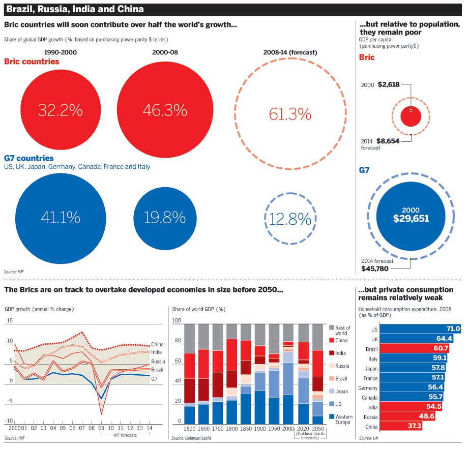
1. How could the growth of the BRICS threaten the existing status quo of superpower status i.e. the core - will the BRICS ever achieve superpower status? Discuss.
2. In what ways and by what means will the BRICS grow?
3. Outline the environmental, economic and social benefits and costs of the rise of the BRICS.
4. Which BRIC is the most important? Which one has all the power? (how would one define power in this context e.g. economic, political etc) 5. Will the growth of the BRICS, notably China, continue? http://www.bbc.co.uk/news/business-15331523
An understanding of maps is fundamental to the study of Geography. Geographers by nature are interested in maps and one of my favourite first year modules at university was Cartography as it enabled me to visualise the data spatially and interpret it.
More recently with the advent of GIS and Google Earth/Maps maps have had in my opinion a brief revival, despite the rise of the Sat. Nav!
The worldmapper website certainly adds a new and updated dimension to how we see the world. The maps move away form the traditional and conservative approach of preserving the existing world order of old regimes/empires. In worldmapper, using information form the UN, the world is reshaped to show factors and trends often hidden by traditional maps.
The amount of data available to geographers is expanding rapidly. The gap minder website makes sense of what is happening in a dynamic and eye-catching fashion. Very useful for Development Geography, Population studies and Medical Geography to name a few areas in which this information can be applied with gusto.
An excellent site here, illustrating how dynamic geography has become as a discipline with regards to presenting geographical data in new ways. Data provides geographers with a brief snapshot of a country and much can be gleamed from accurate information.
The Ordnance survey blog shows an interesting clip on how the geography of Britain changes constantly and how these changes are mapped and recorded on the OS Master map database; in their own words the nation's 21st century Doomsday book!
The video shows an 18 month period in which you’ll see there isn’t a single part of the country that hasn’t been updated. That’s a lot of change.